
A New Look for Dytron – Change of Corporate Identity and Logo
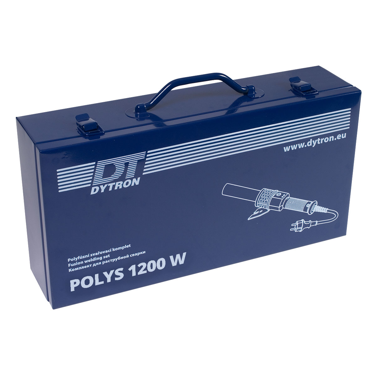
The change of our logo and Dytron’s company identity is inspired by our Dytron welder – a unique Czech polyfusion welder. Following many years of continuous development of our Dytron welder, we realized that progress is not just about a high-quality product, but also about appropriate visual expression and communication. That’s why we decided to invest in a new corporate identity that humbly reflects our original logo, while at the same time showing the pride we take in innovation and quality, which are crucial to us at Dytron
Take a look at the different versions of our new logo.
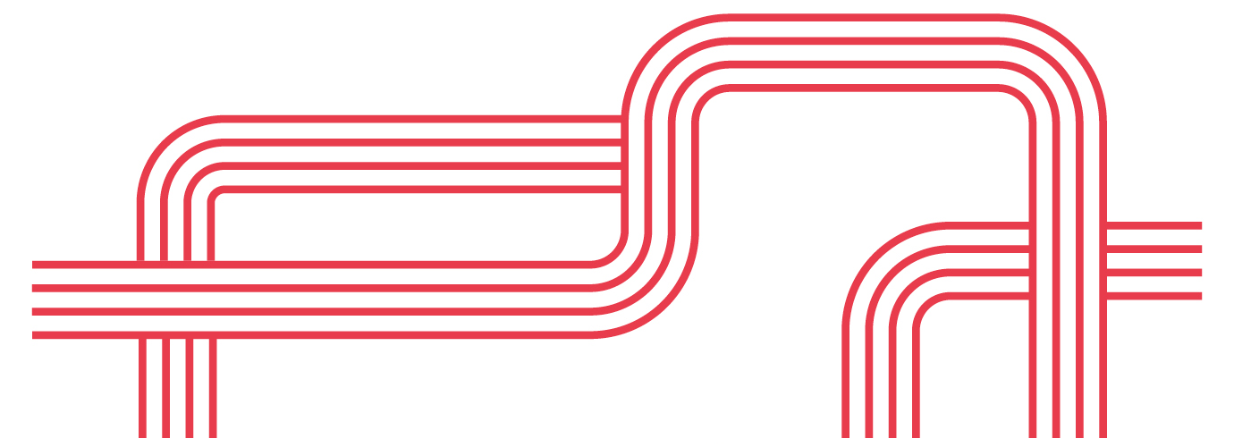
The brick red color symbolizes the hot welders and the heat that needs to be developed during welding.
On the other hand, blue is the symbol for the medium that flows in the welded pipes. Whether it is water or gas, we associate it with the color blue. At the same time, we have used blue as a link to Dytron’s original identity.
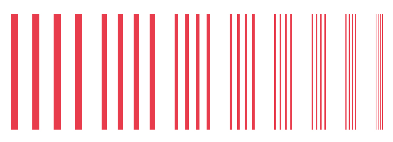
In addition, as a graphic element we have chosen lines symbolizing various pipes that are welded by our welding equipment.
The designers David Faigl and Ota Nussberger from the Czech Promotion advertising agency are behind the creation of the corporate identity and logo.